Fresh Design + Easy to Update
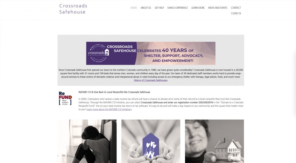
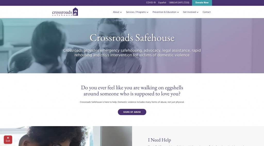
Crossroads Safehouse’s site before we revamped it was in disarray. The biggest overarching goal of the Crossroads redesign was to build credibility in their non-profit. To garner donations, they need to look as professional as their non-profit really is!
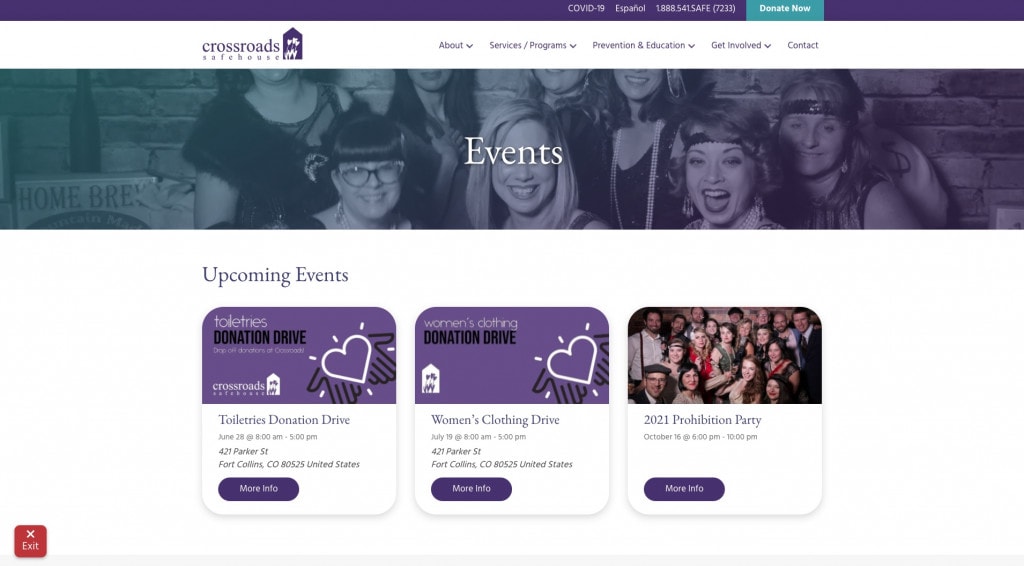
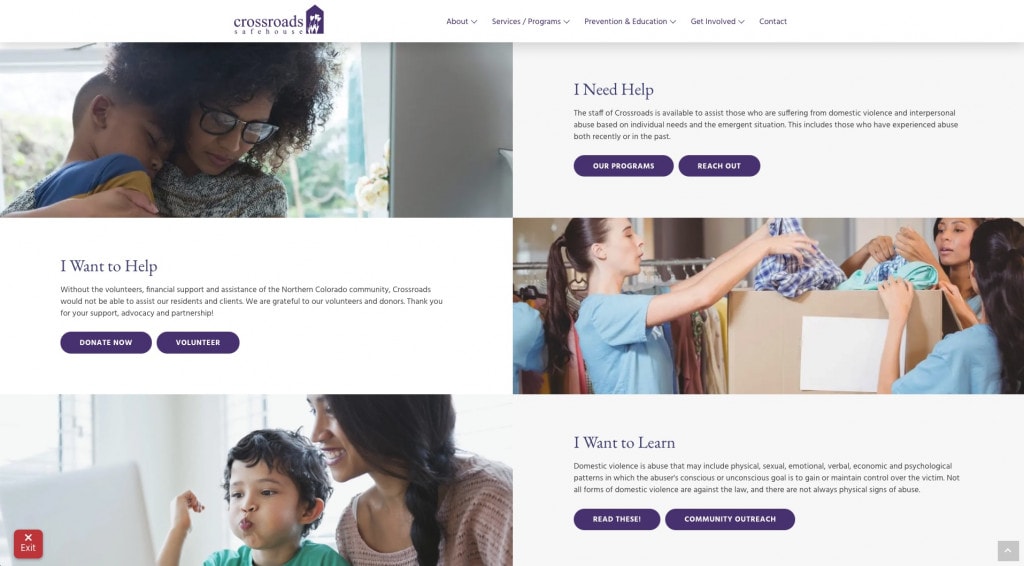
We took the colors of their rebrand from a couple of years prior, and used that color along with modern white space to bring up that level of professionalism. The old site wasn’t even using the logo in the header. That got fixed real fast 😉


Crossroads continues to be great to work with. They have a great cause and the people who work there are amazing!


